We will be doing our editing using Snapseed, a free but powerful mobile app that's available for iPhone and Android devices. You can download it at the App Store or on Google Play. I'll give you some basic advice on how to use it, but if you want to know more here is a good overview of what it can do. We are looking at correcting certain details of our images through single parameters, as opposed to just adding one of the pre-baked 'Styles' that are available in the app. It is more valuable to learn to correct and enhance each image in a specific way, or to manually create a specific look that might make sense in the frame of your project.
Exercise for this tutorial:
Engaging the archive: Browse one of these archives [ukphotoarchive.org.uk Carpenter Collection Farm Security Administration Collection] and visually respond to an image of your choice: photographically, you can address it in a different context, respond polemically, subvert it or critique it through the image you will create. The aim is not to re-create the image, but to reference the shift between the context of the time and the present day. It can be done in a very subtle way that doesn't look like the archival image at all.
Create a simple Web Page in Adobe Creative Cloud Express and upload the images there with a brief text that explains what you did. Submit the link on Blackboard 24 hours before next week's tutorial.
Basics
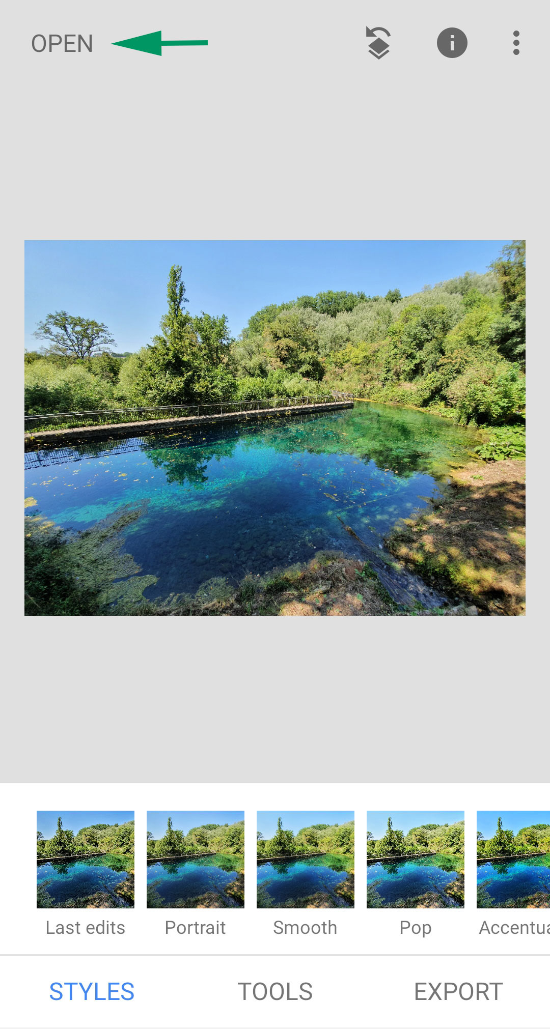
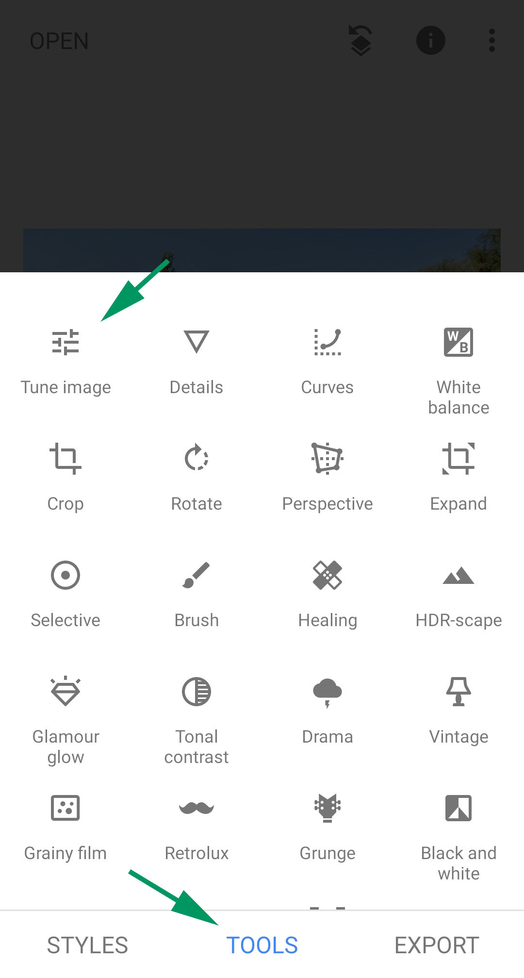
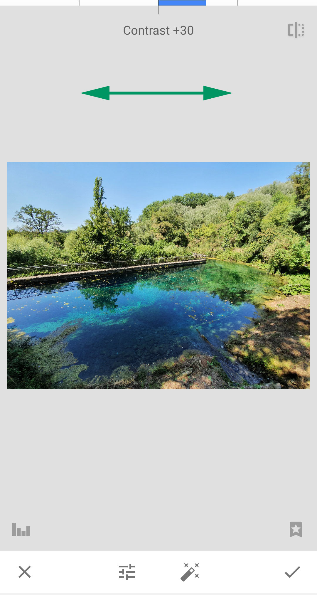
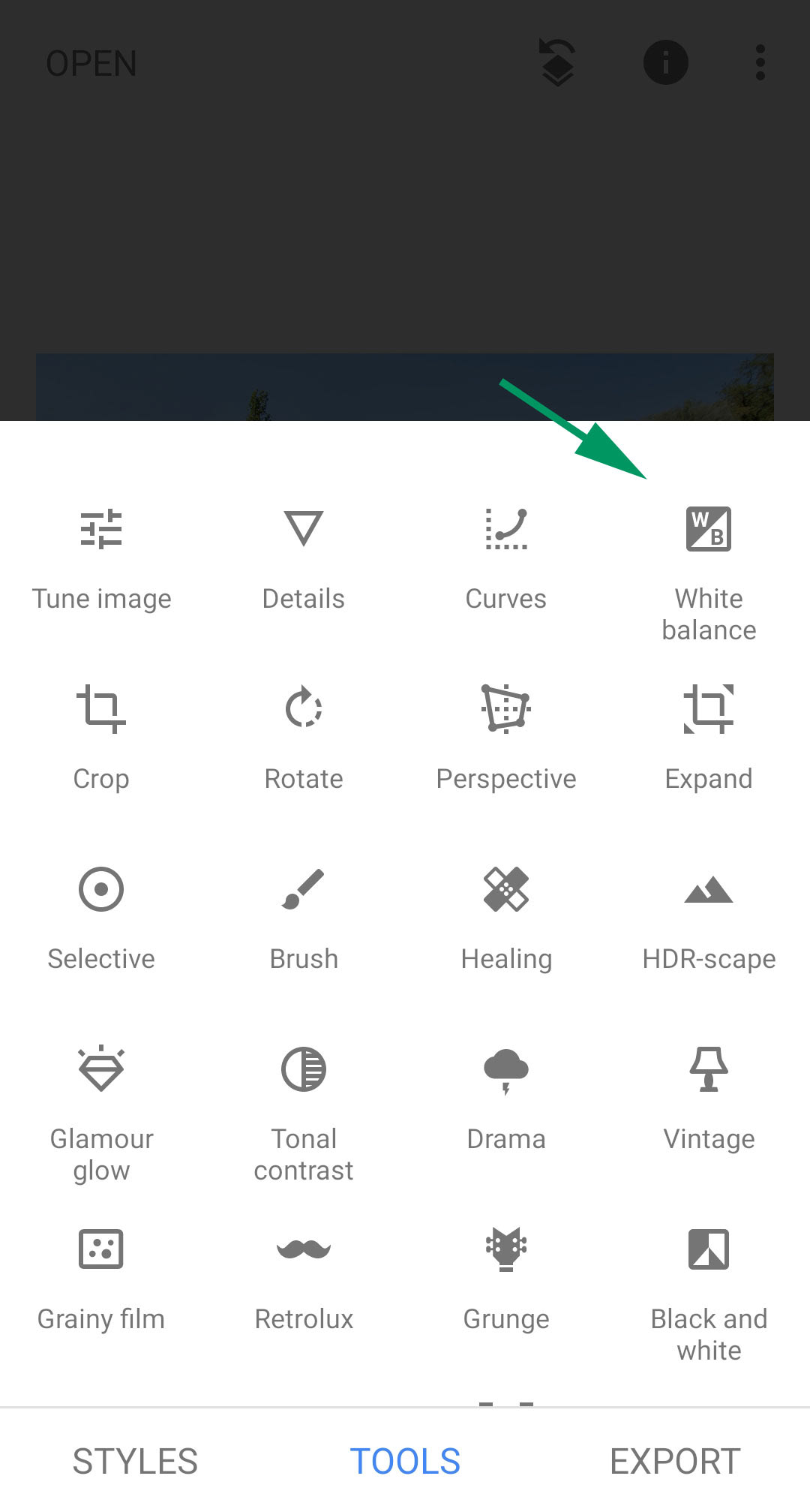
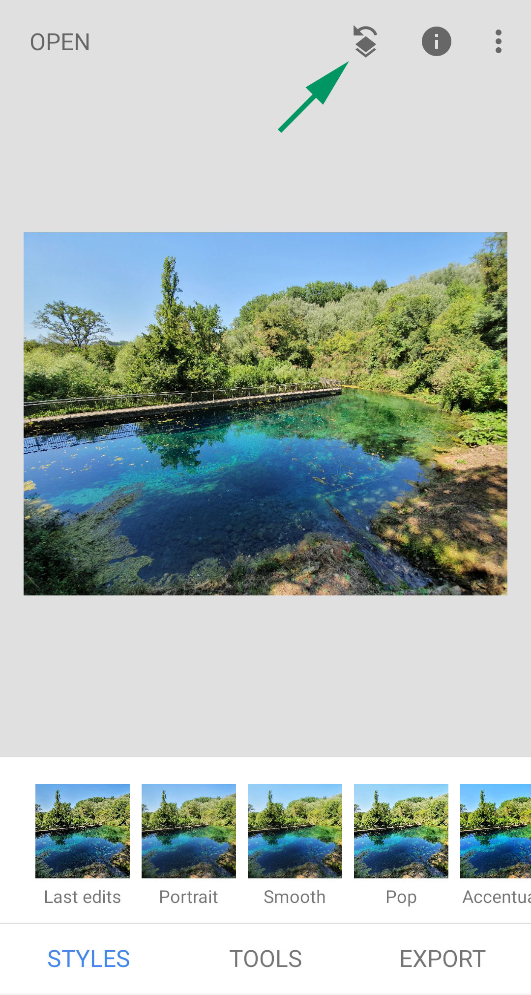
The first thing you need to do is to open an image. You will need to navigate to the folder where you have your photographs. Rather than applying the Styles you see at the bottom of the screen, tap Tools where you have the most creative options. Once you select a tool, most parameters will be selected by swiping up or down, and their amount applied by swiping left to right.
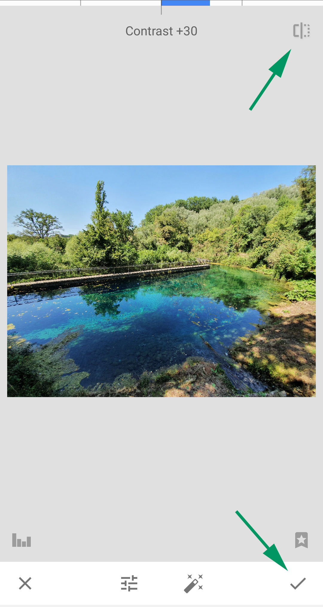
When you are done you can view the effect of your edit by holding down the icon at the top right of the screen, which temporarily reverts back the effect. This way, you have a quick before/after preview. You will then apply the edit by tapping the checkmark icon at the bottom right of the screen.
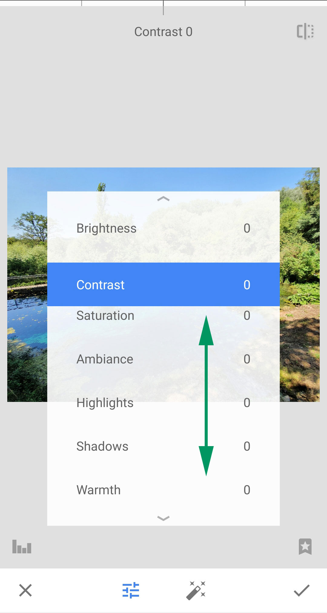
Tune Image is one of the most useful tools to apply as a first thing. Its parameters are:
• Brightness: Darken or brighten the entire image.
• Contrast: Increase or decrease the difference between the dark and bright areas.
• Saturation: Make the colours more or less vibrant.
• Ambiance: A twist on contrast, adjust the balance of light in the entire image.
• Shadows: Darken or lighten only the shadows (dark areas) in your image.
• Highlights: Darken or lighten only the highlights (bright areas) in your photo.
• Warmth: Add a warm orange or cool blue colour cast to your image.
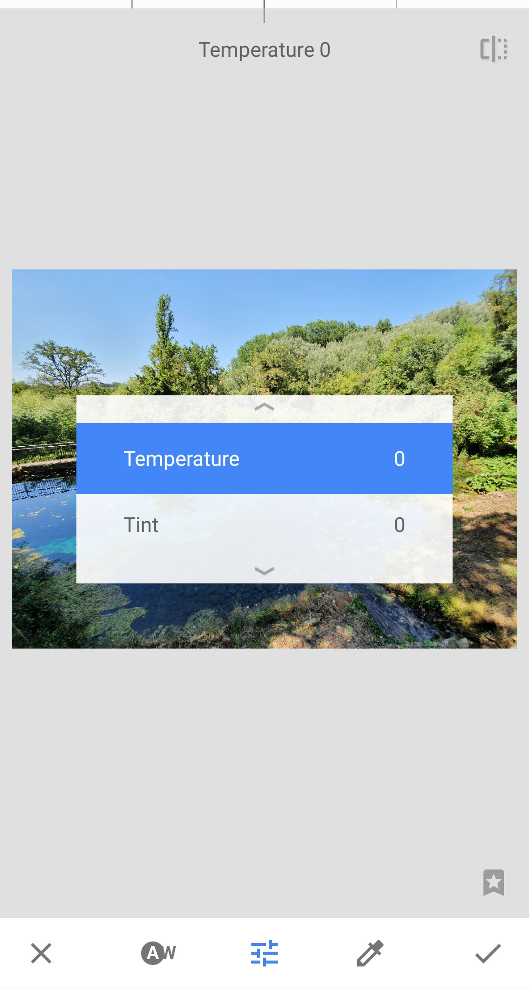
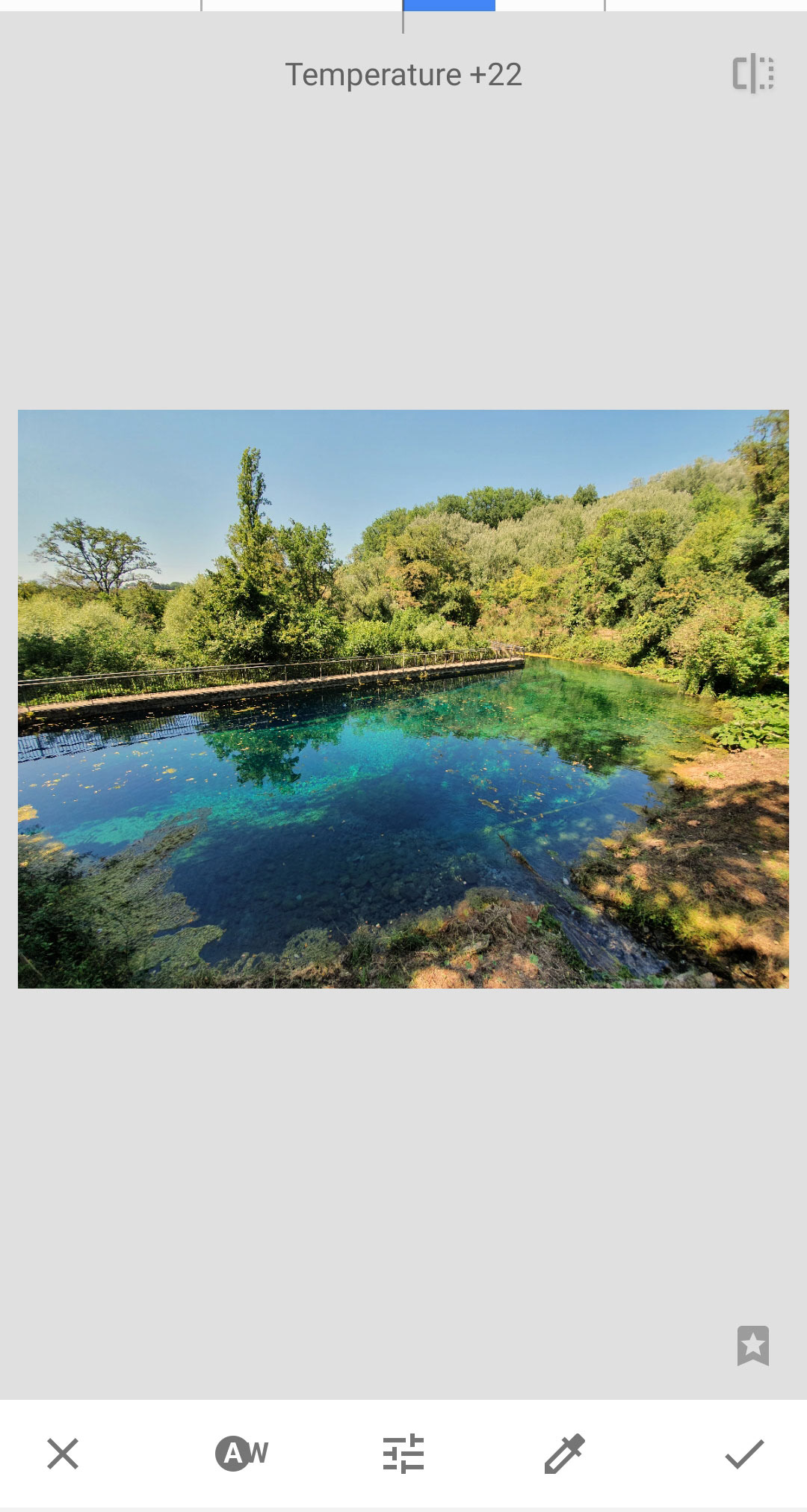
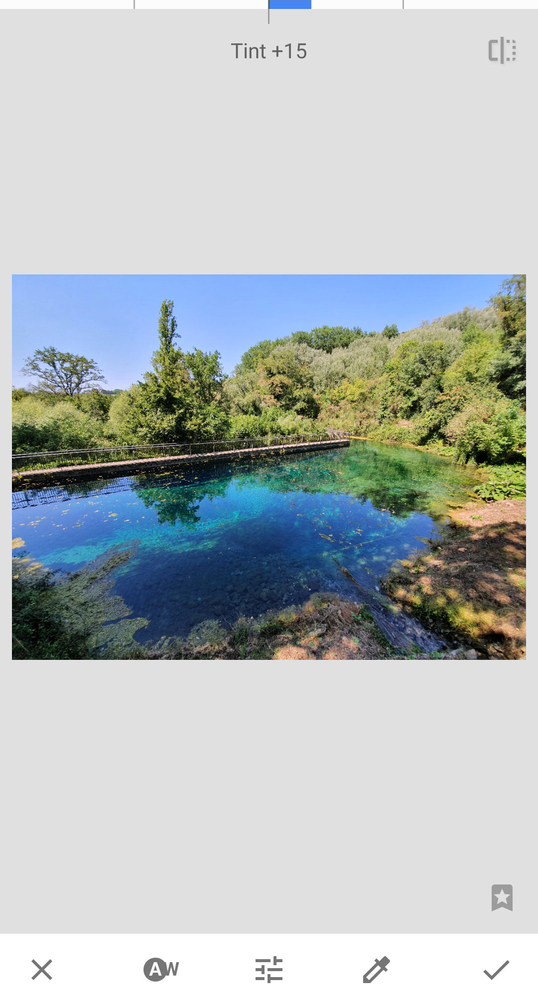
White Balance
We have looked at white balance in the last workshop. You can do some limited adjustments to white balance after you have shot the image, with two parameters: Temperature, which alters the colours towards blue or yellow, and Tint, which goes from green to magenta (this is particularly useful for neon light, which creates a greenish cast).
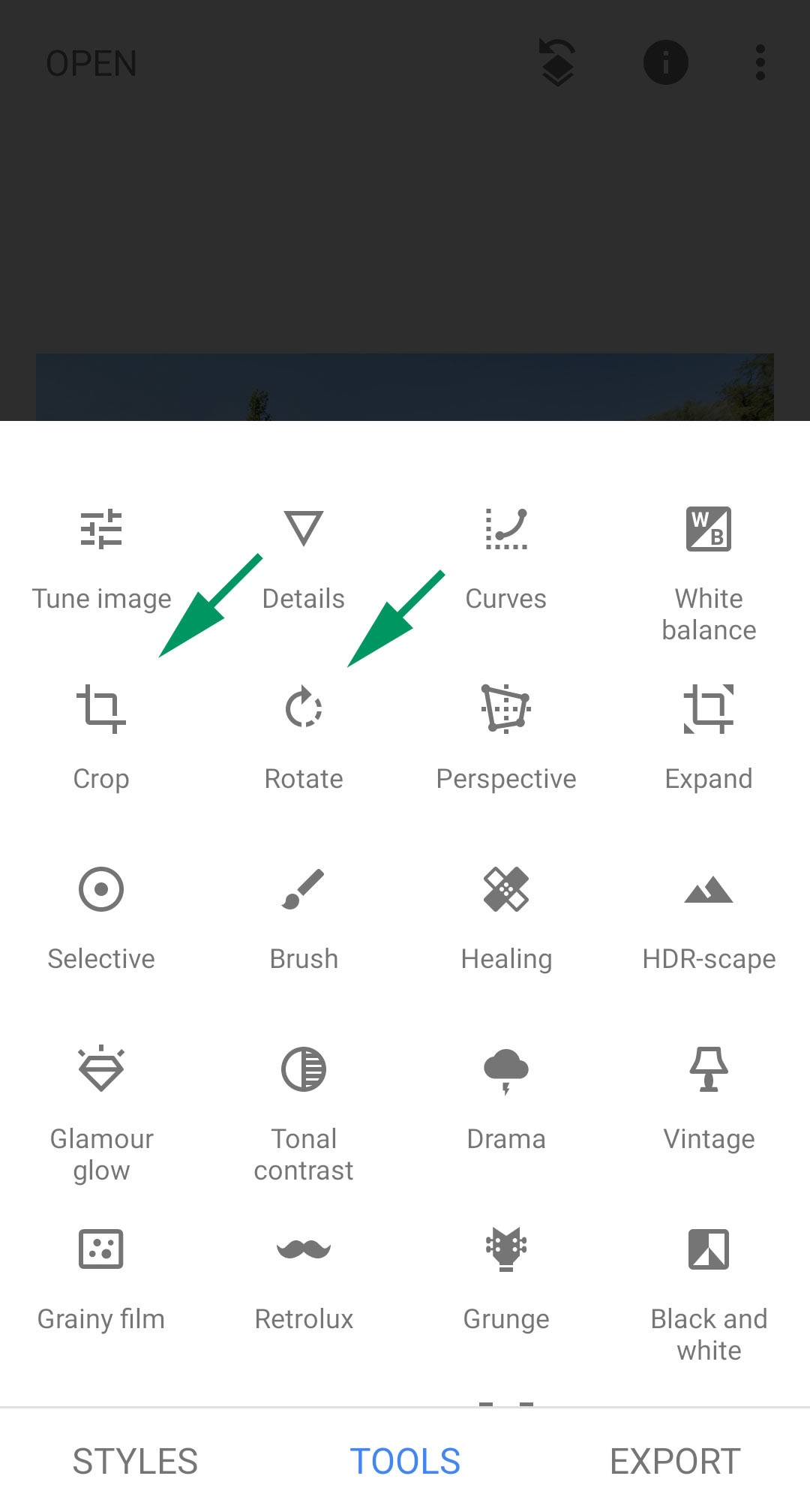
Cropping and rotating
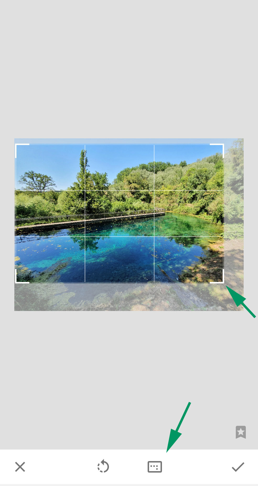
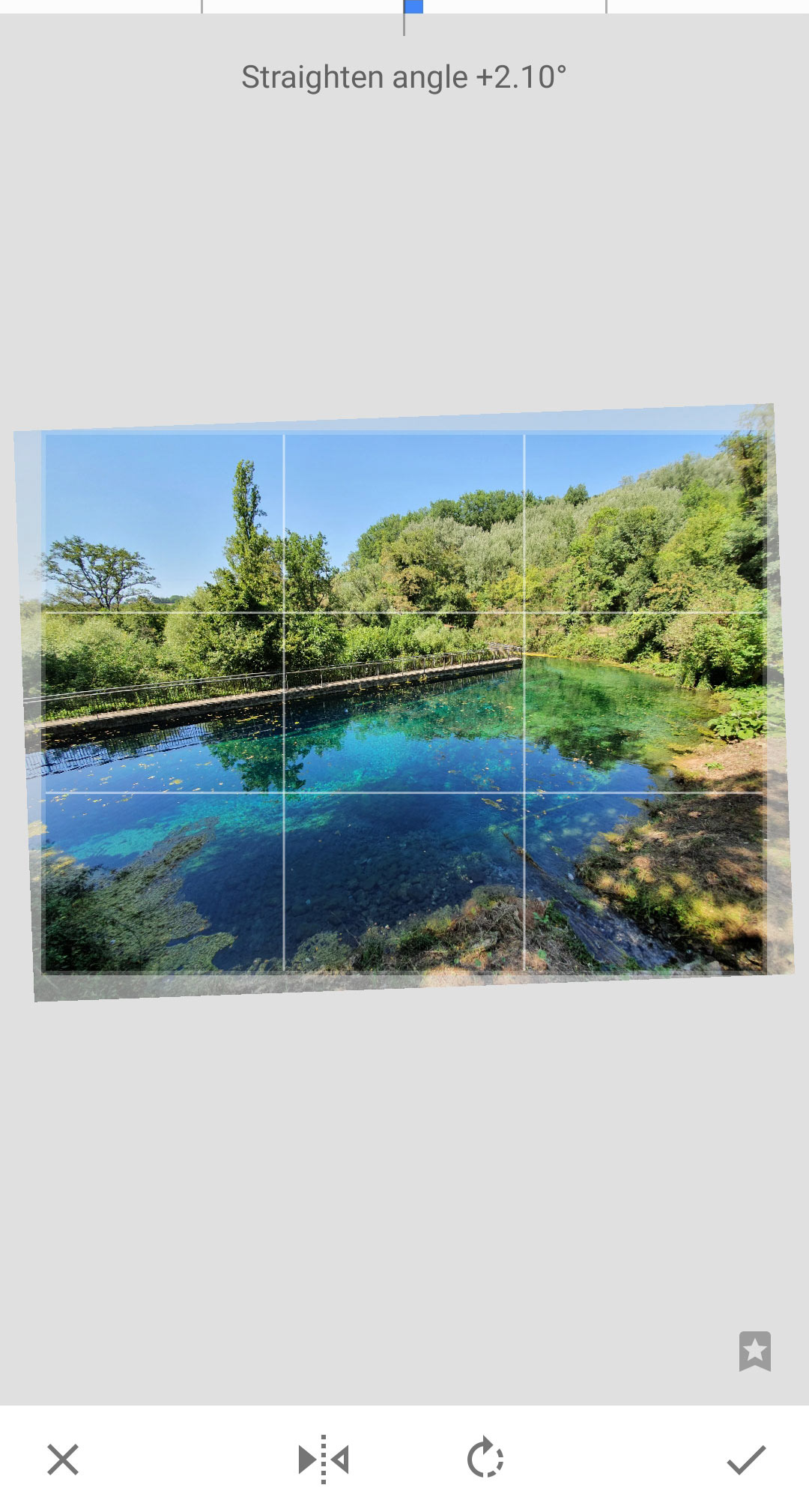
Two very useful tools to correct your framing. You can drag the frame from the angles to crop an image, and at the bottom you find a selection of common aspect ratios including square, 3:2, 4:3 and 16:9. Rotating is also very intuitive, you just use two fingers to correct a crooked horizon. You can also apply 90 degree rotations or flip the image with the icons below.
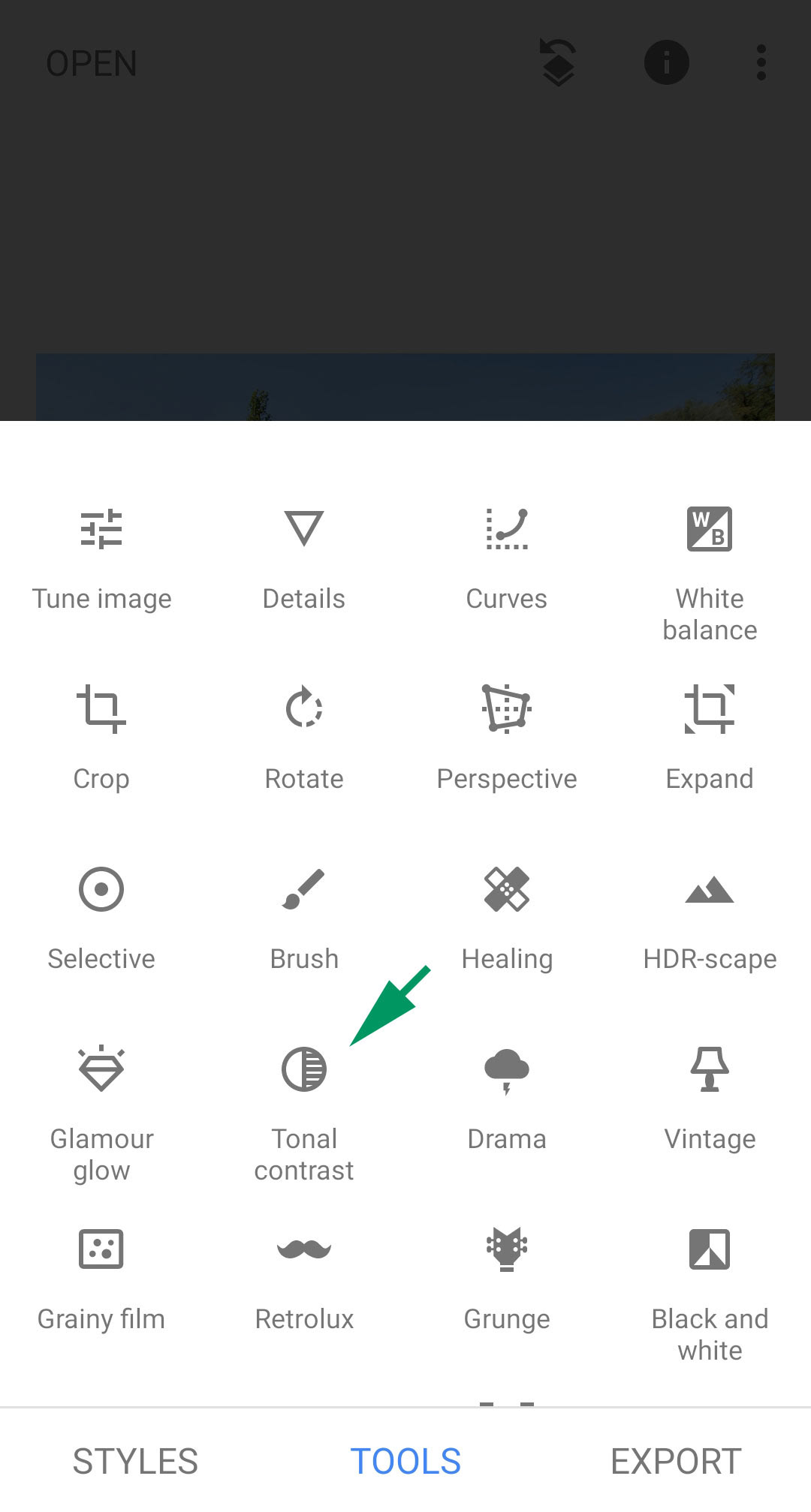
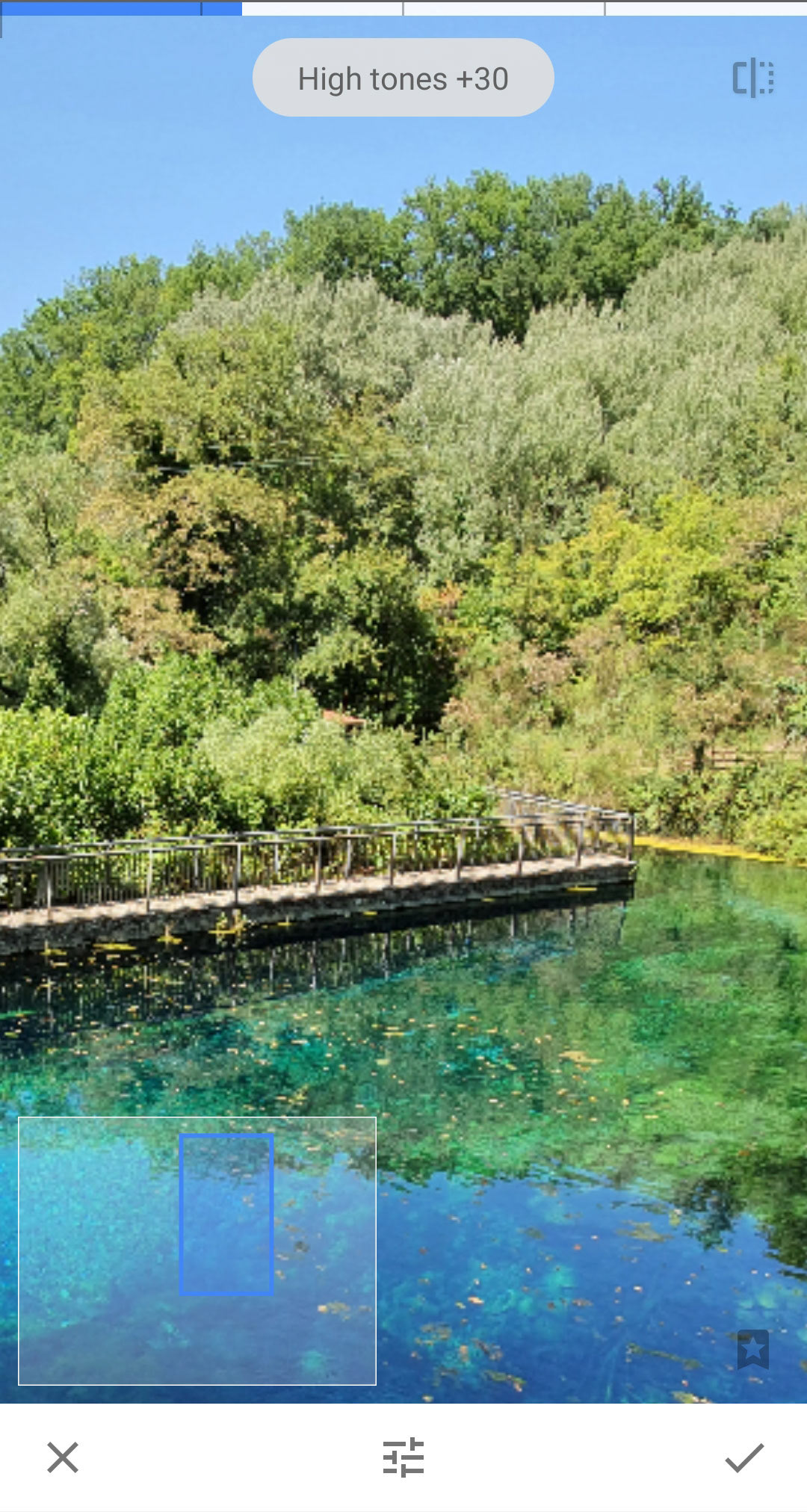
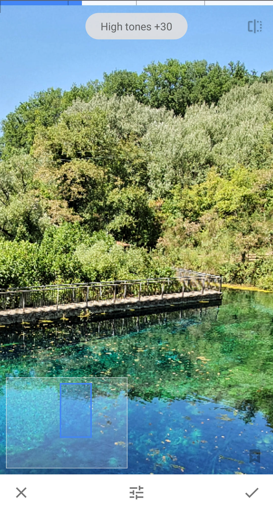
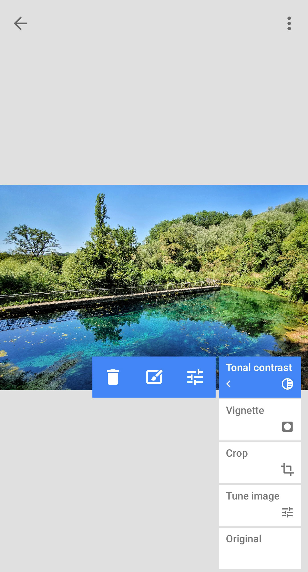
Tonal contrast and Loupe
I find Tonal Contrast a useful tool, it increases local contrast making the details pop out and increasing clarity. Through the parameters you can reduce its intensity if it seems too much for a certain image.
In any situation you can double-tap on the image to zoom in closer to check how your edit is affecting the details of the photograph.
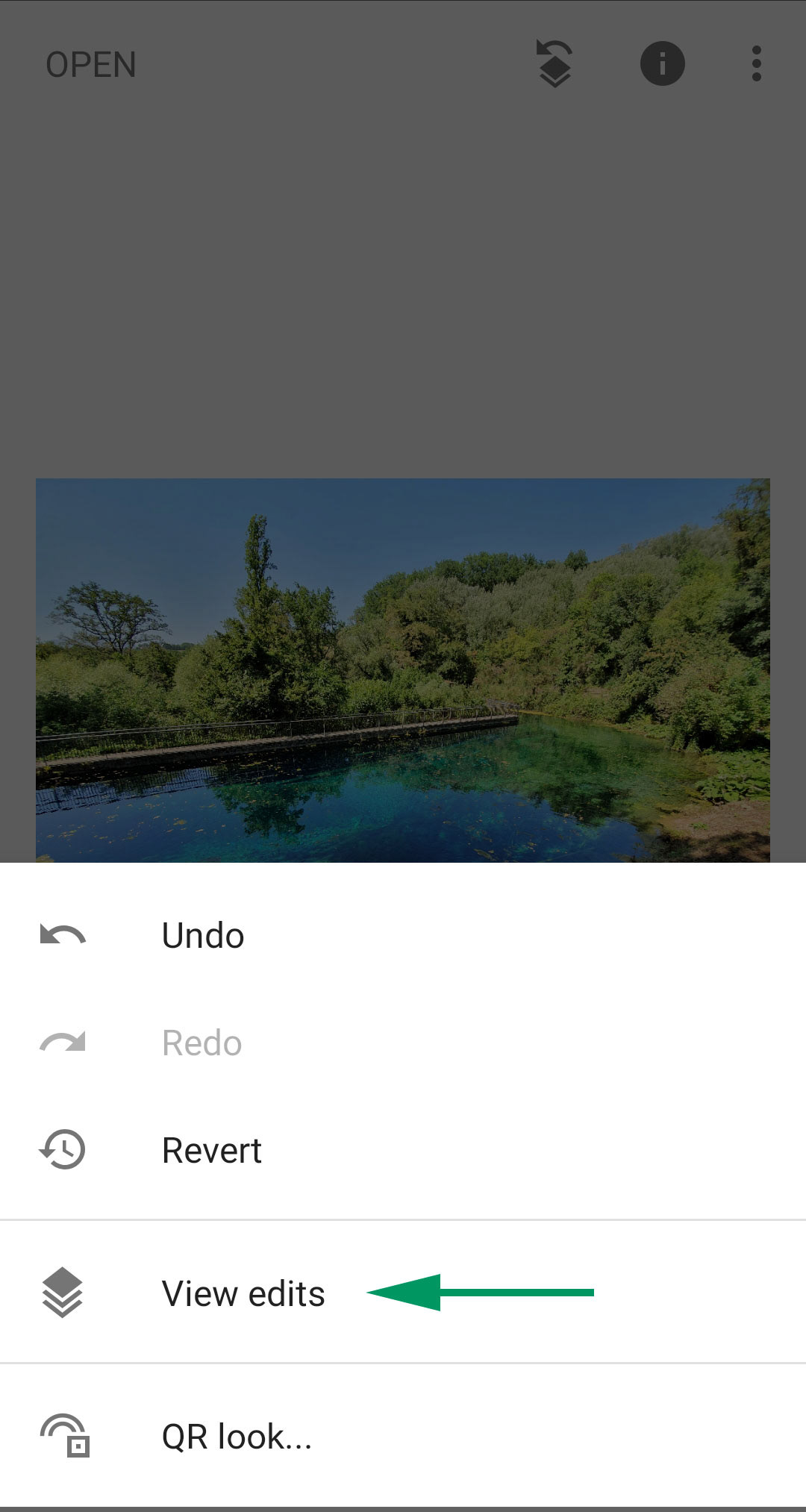
Retracing your steps
If you change your mind on something, you can undo your edits in a linear or non-linear way. Undo will simply take you a step back, but View Edits is a much more flexible and powerful function. Here you can delete selected edits without affecting the ones you applied afterwards (bin icon), or modify the parameters for edits you applied beforehand (sliders icon). You could also apply the edit to selected parts of the image only (brush icon).
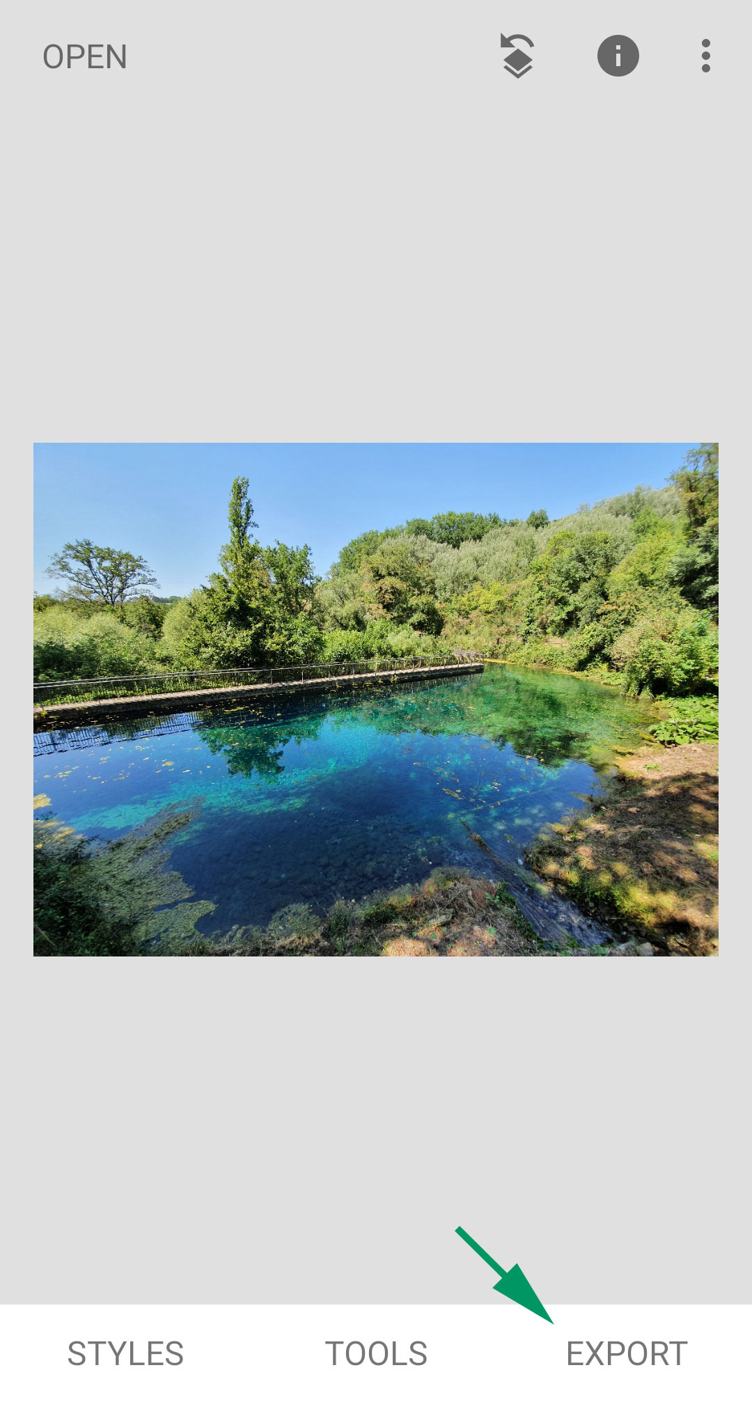
Saving/Exporting
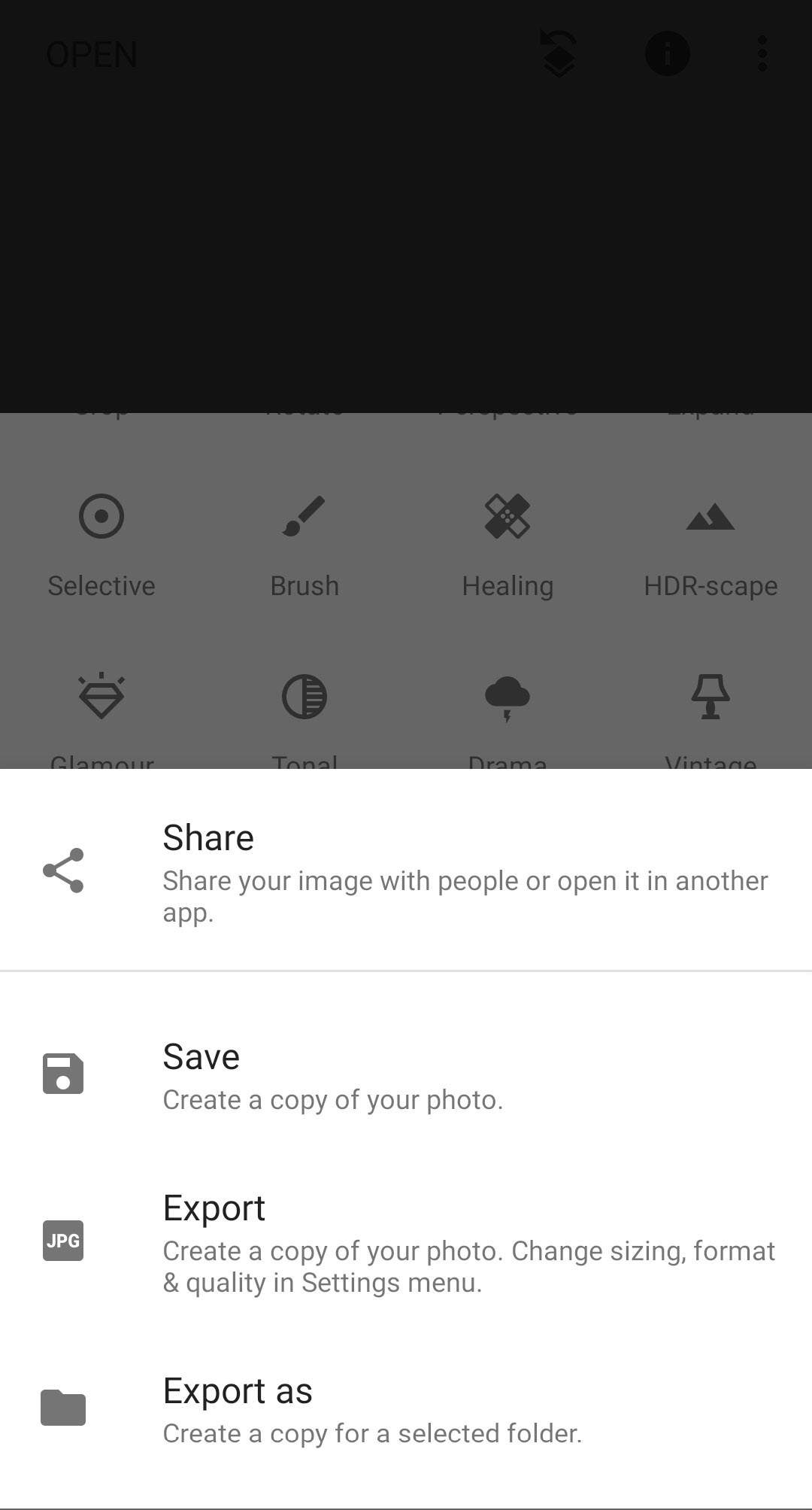
Once you think you are done, you can save a copy of your now-edited image. Tip: you can view a before/after of your edits by holding down your finger on the image in the home screen.
Tap Export, and then you have a choice of Save or Export. Share will do the same as Export but open your share options directly afterwards, while Export As will simply allow you to choose the destination folder. The main difference is in the file that is created. Save creates a high-quality, full resolution file while Export can be set to create a smaller file, with reduced resolution and compressed quality, which can be more useful for social media or other online uses. If you want to copy the settings I have in the screenshot on the right, they will do fine for your photo-essay or exercise submissions. Either way, don't ever delete or overwrite your original files, always create copies.
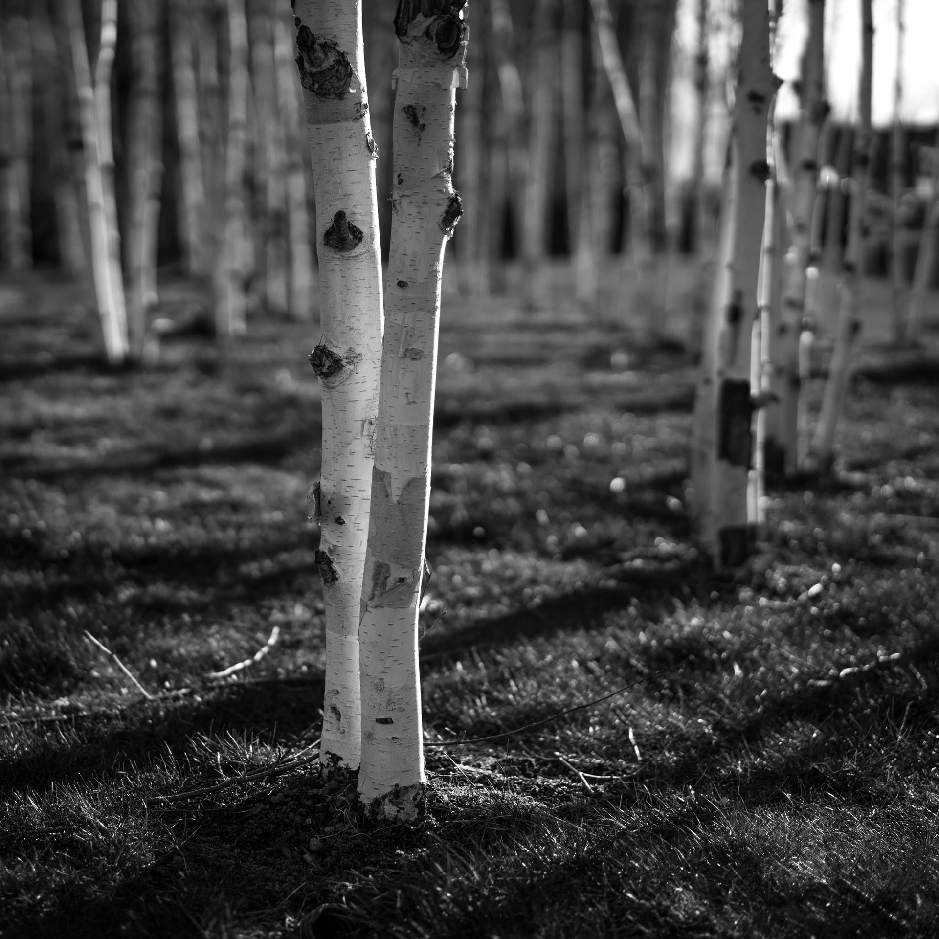
High-contrast black and white to emphasise the shapes, and square format to recall fine art photography
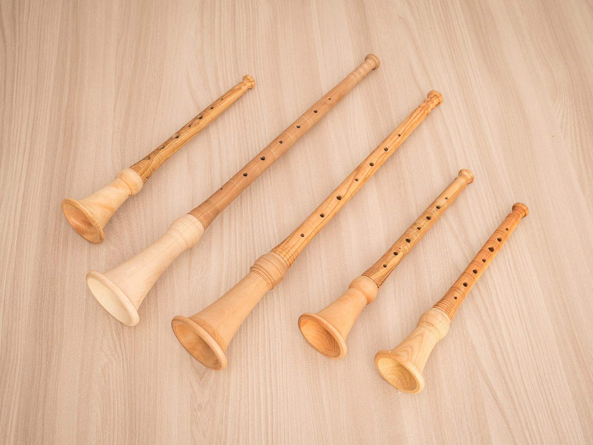
In this type of 'product photography' I edit so that there are almost no shadows, the effect is mindful of an Ikea catalogue or similar commercial photography
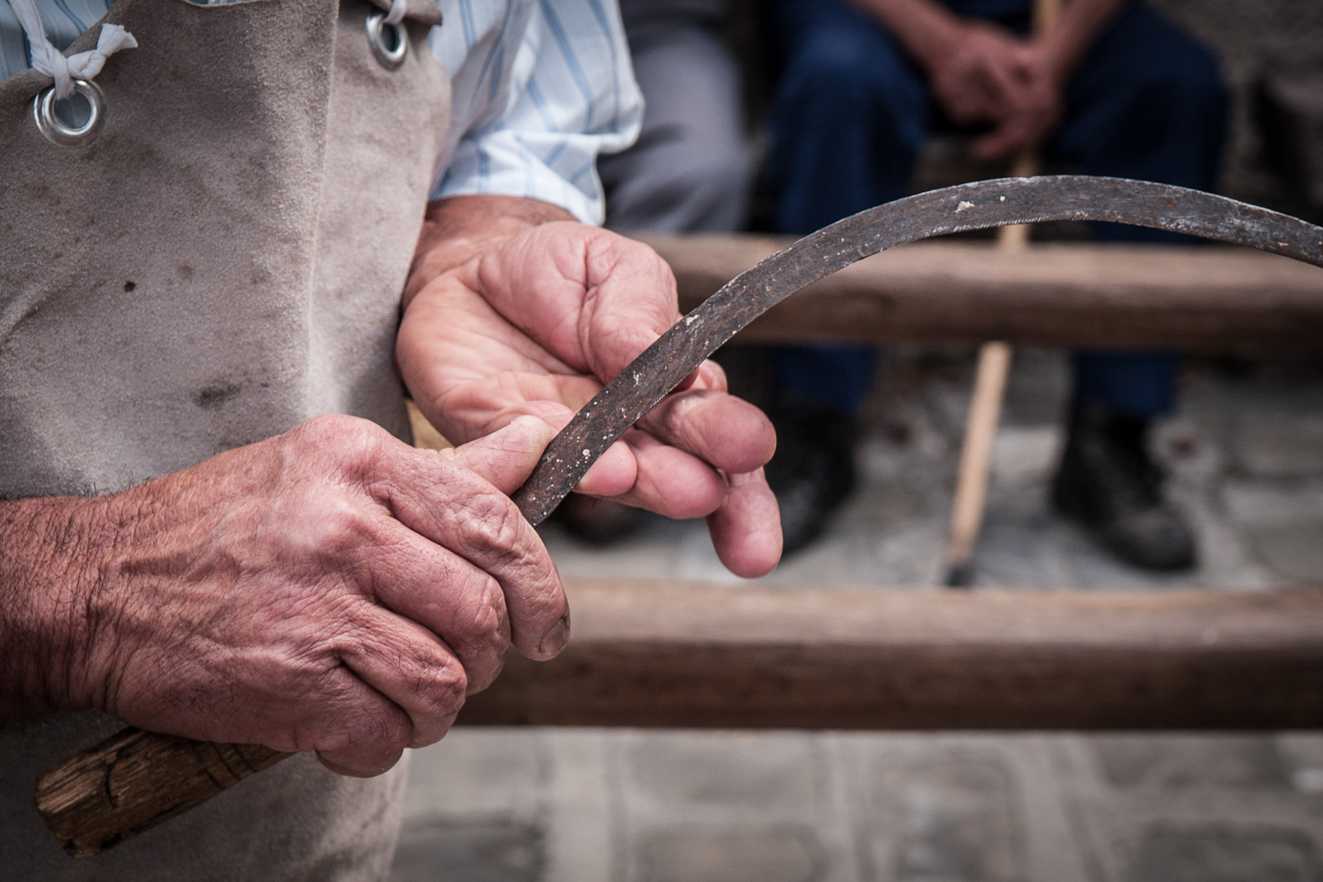
Here I desaturated the colours and increased clarity (Tonal Contrast in Snapseed) to emphasise the roughness of the textures, which almost tell a story
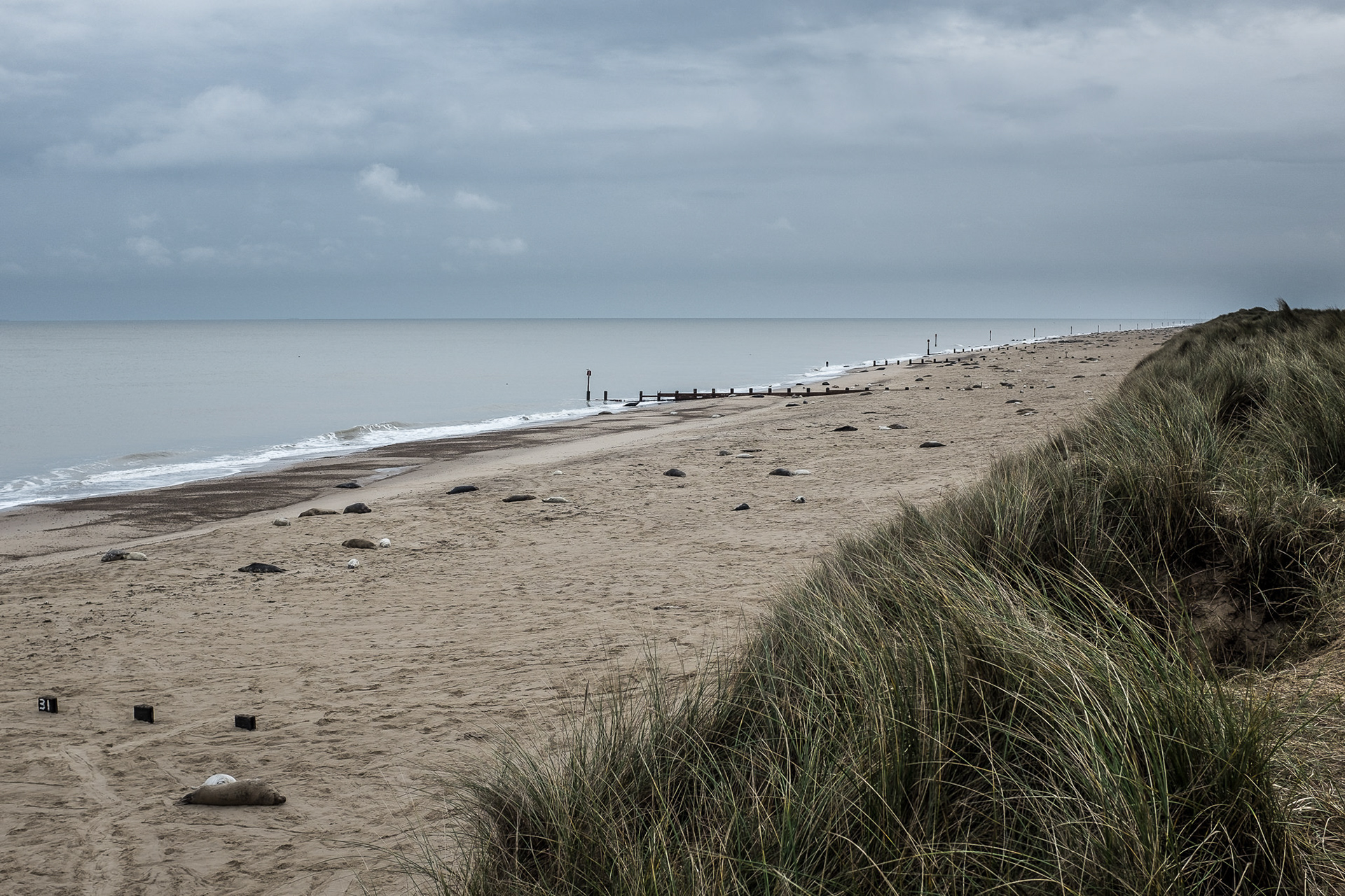
In this case low contrast and low saturation render a sense of the bleakness of that day on the Norfolk coast
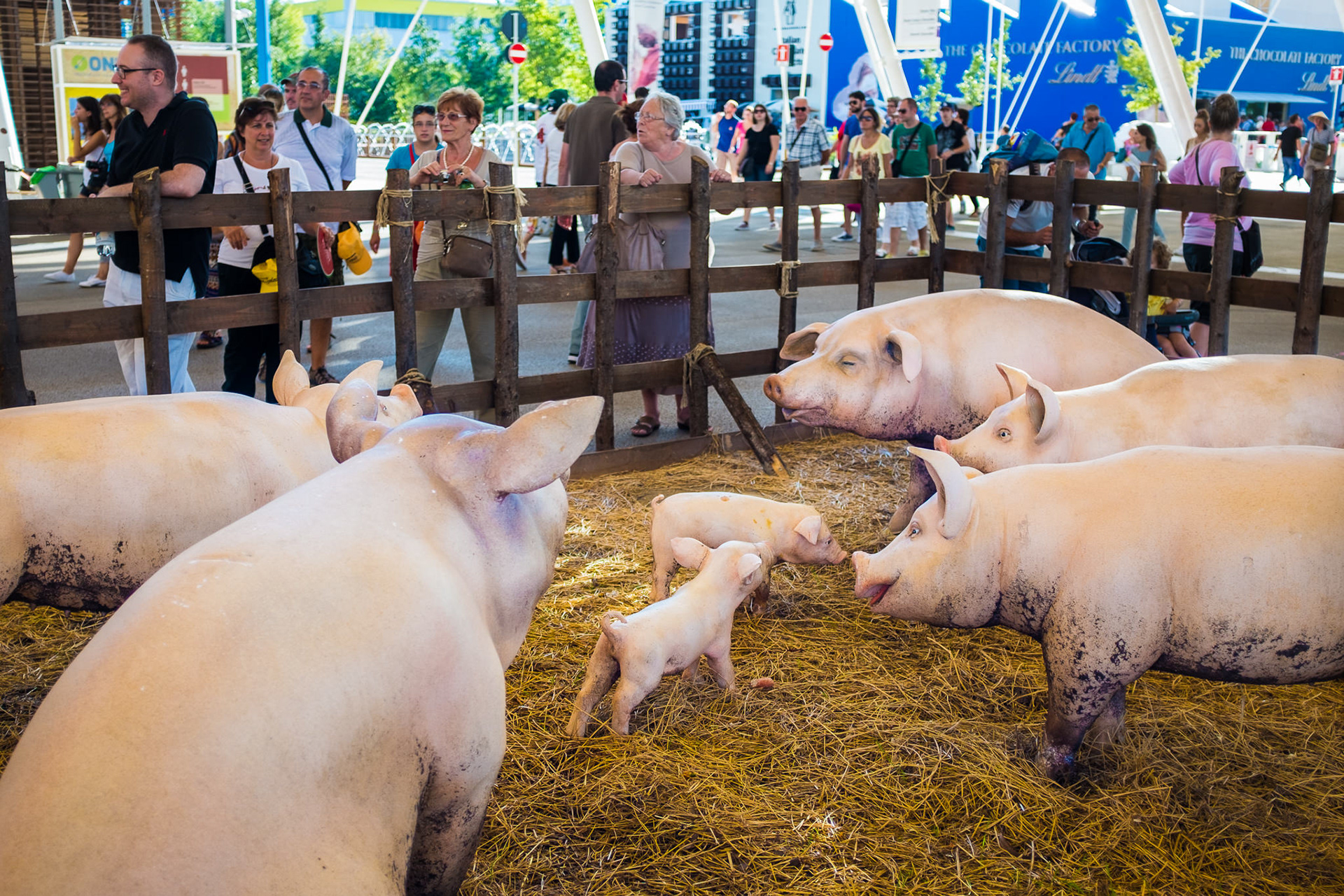
Plastic pigs? This looked to me straight out of a Martin Parr book so I boosted the saturation to make a visual reference
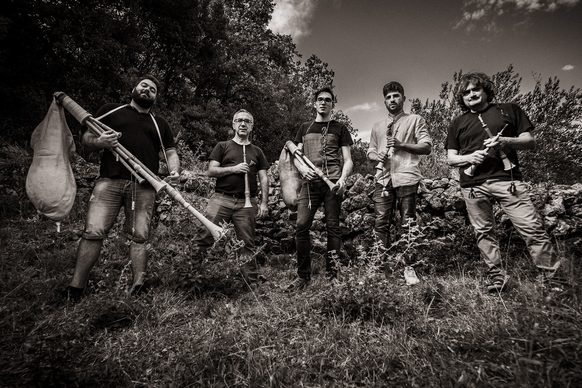
This is a sepia effect that is meant to recall band photoshoots from the end of the 1960s...
In conclusion...
Some of what we covered has to do with corrections, or fixing aspects of the image that you think would improve it. Another aspect of editing images has more to do with styling, that is the more creative side. When you look at the work of photographers you like, think about the technical qualities of their images and their role in enhancing the meanings in their work. Black and white being used to enhance the formal qualities of an image, or to make it more abstract. Saturated colours are a favourite of travel photographers and often intersect with exoticist approaches or recall commercial photography. A low contrast image might suggest an intimate and respectful gaze, or recall painting. A 3:2 aspect ratio is usually associated with photojournalism, while in the pre-Instagram era square frames were typical of medium format and so associated with fine arts photographs. There's a lot you can do but it requires learning to see these formal aspects in images and learning to connect them to their function in a photographer's work.
If you want to learn more about Snapseed, check out this guide.