Composition is one of the most powerful tools that you have available to make your photographs unique and meaningful. Through composition you can arrange the elements of your image, emphasise some or exclude others, suggest a mood or reference
People often call these rules, but they are really techniques because you find people breaking these "rules" all the time. Below I list some principles to help you find the right technique for your shot. There's a lot to learn and many of these principles have something in common with what you can read in art history books. But the best advice is to look at the work of photographers you like and analyse it, to try to understand why their images are appealing and work so well. With time, you will develop an eye for composition and a style of your own.
Exercise for this tutorial:
IMPORTANT: Before you undertake any practical exercise you must fill, sign and return to the course giver the CW1 form you find on Blackboard. Your subjects also need to sign a consent form for each exercise.
The Defining Sequence: Create a short sequence of 7 images centred on a person you know. Decide if you want to use a documentary approach, following them in aspects of their daily life within the confines of your home, or create a series of formal portraits, or take a different approach. Create a simple Web Page in Spark and upload the images there with a brief text. Submit the link on Blackboard 24 hours before next week's tutorial.
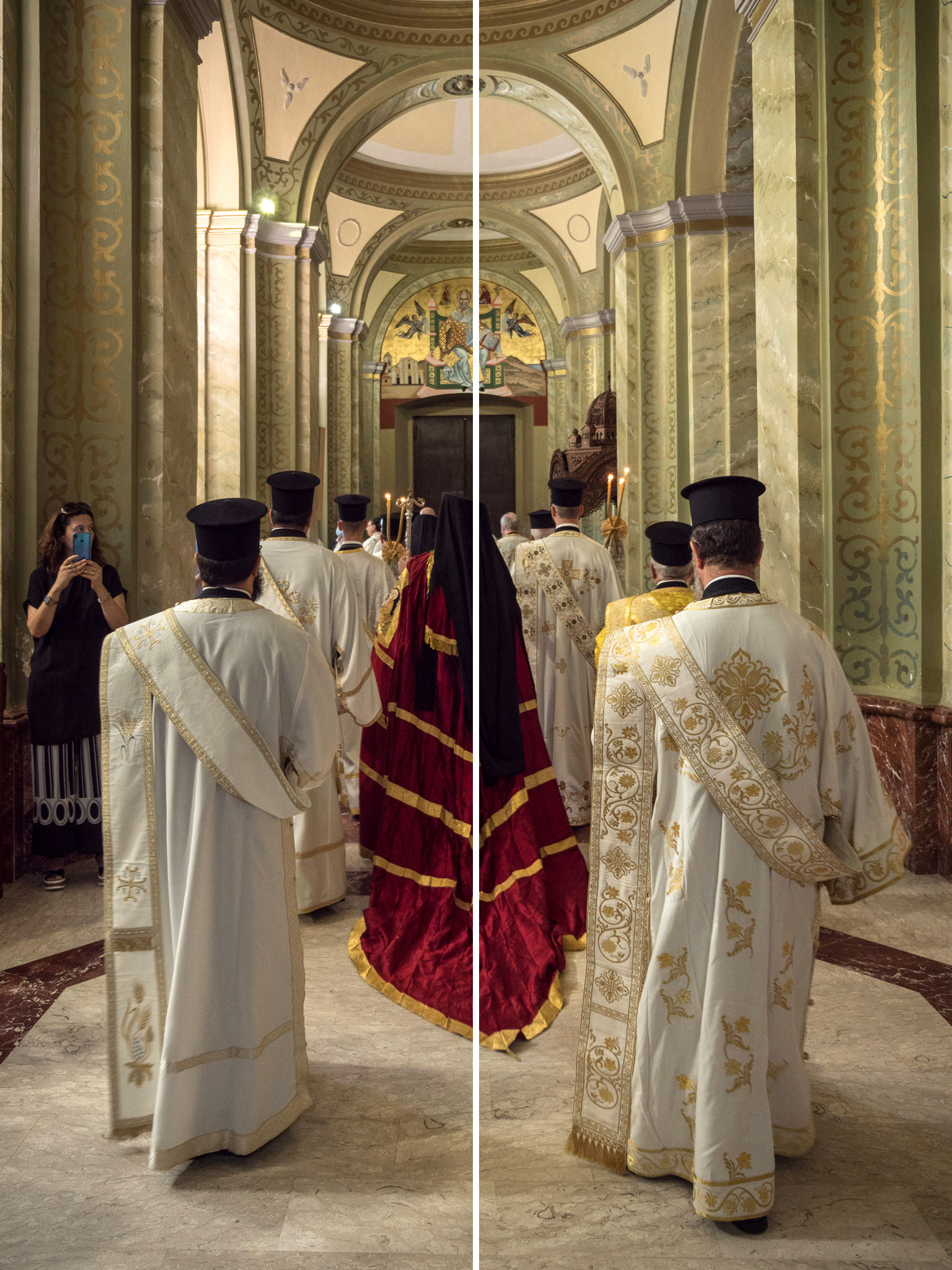
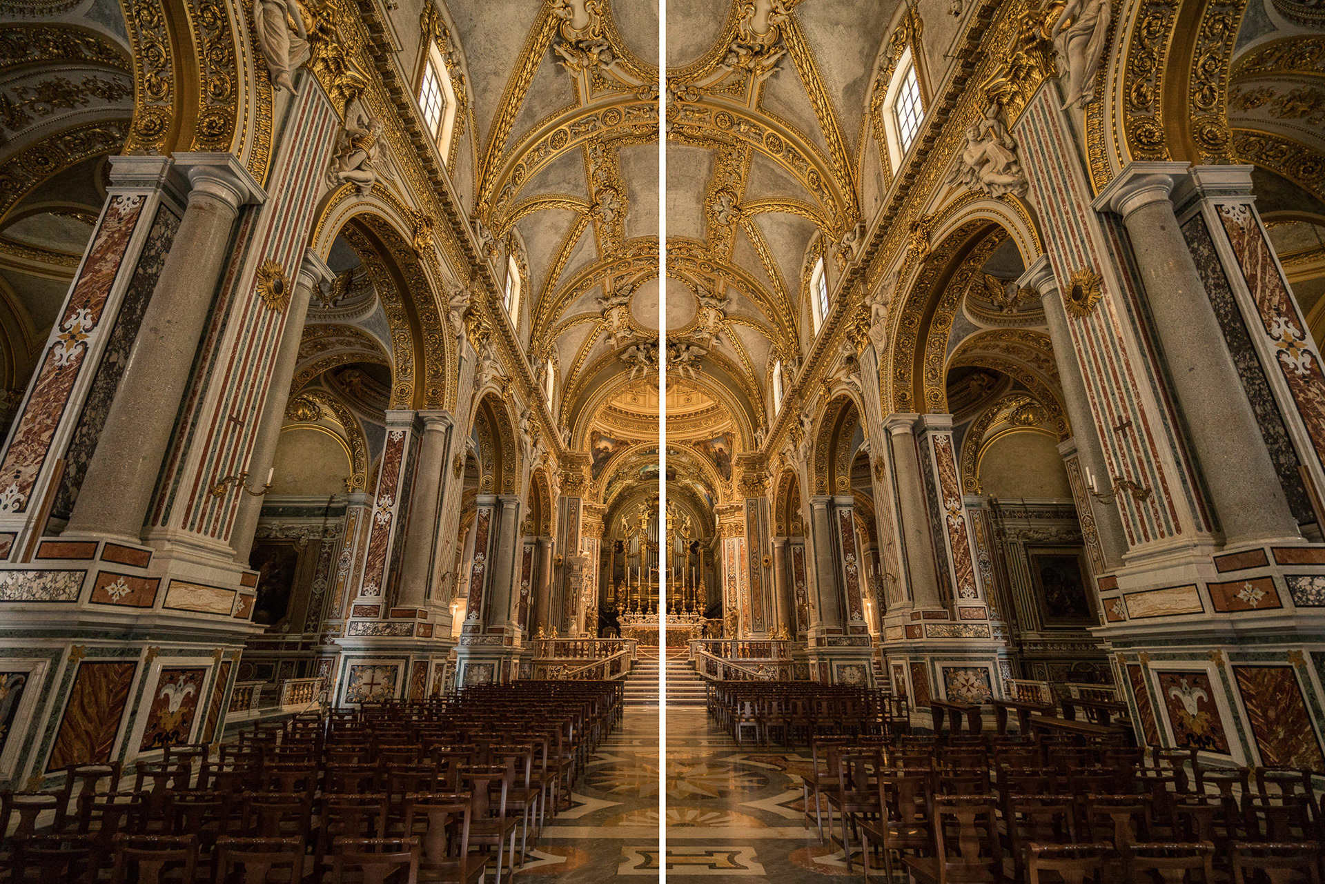
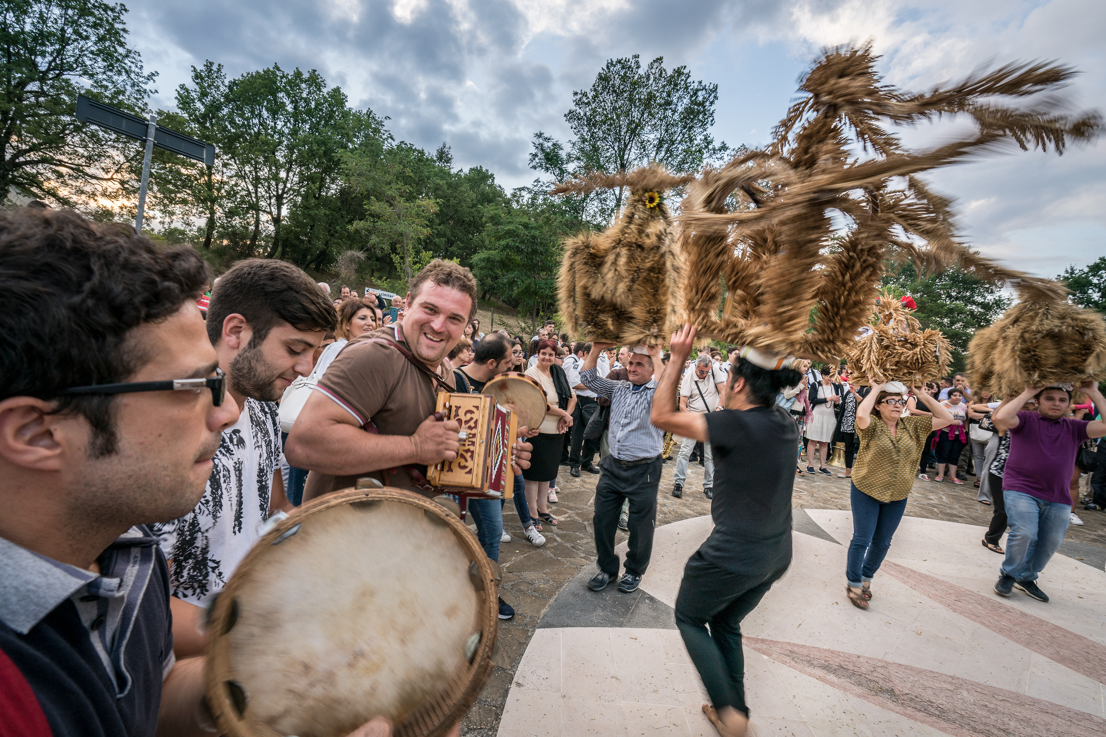
(A)symmetry
Usually a way to make images more interesting is to compose them so that they are unbalanced, and so more dynamic. The most common "rule" you will find described around is that of thirds, which is based on dividing an image in two equidistant horizontal and two equidistant vertical lines, and align a point of interest with one of the intersections between them. There are other proportions that allow to decentre the focal point: look up the golden ratio or the phi grid, for example. Sometimes, though, an image can work precisely because it is strongly symmetrical.


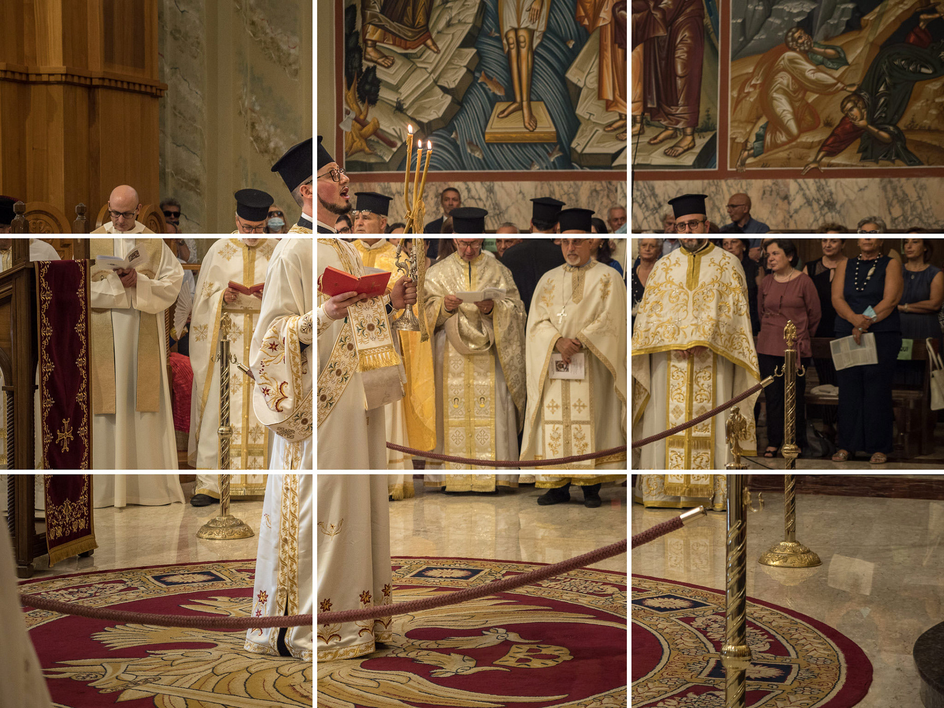
Leading lines
Photography is essentially a bi-dimensional rendition of a three-dimensional scene, so often the photos that work are the ones that give back that sense of depth, or at least draw our eye somewhere in the image. Lines that can perform that function (they aren't always straight lines) can be found everywhere, if you look for them. If you identify a strong line in your composition, try moving around and letting it cut across your image in different ways. In general, diagonal lines give a sense of perspective and work better than lines parallel to the frame.


How is this image different from the previous ones? In all the others, the foreground leads into depth, the person is turned towards the space. Here the foreground person looks away from the depth. Sometimes this can have a meaning, but honestly in this shot it doesn't
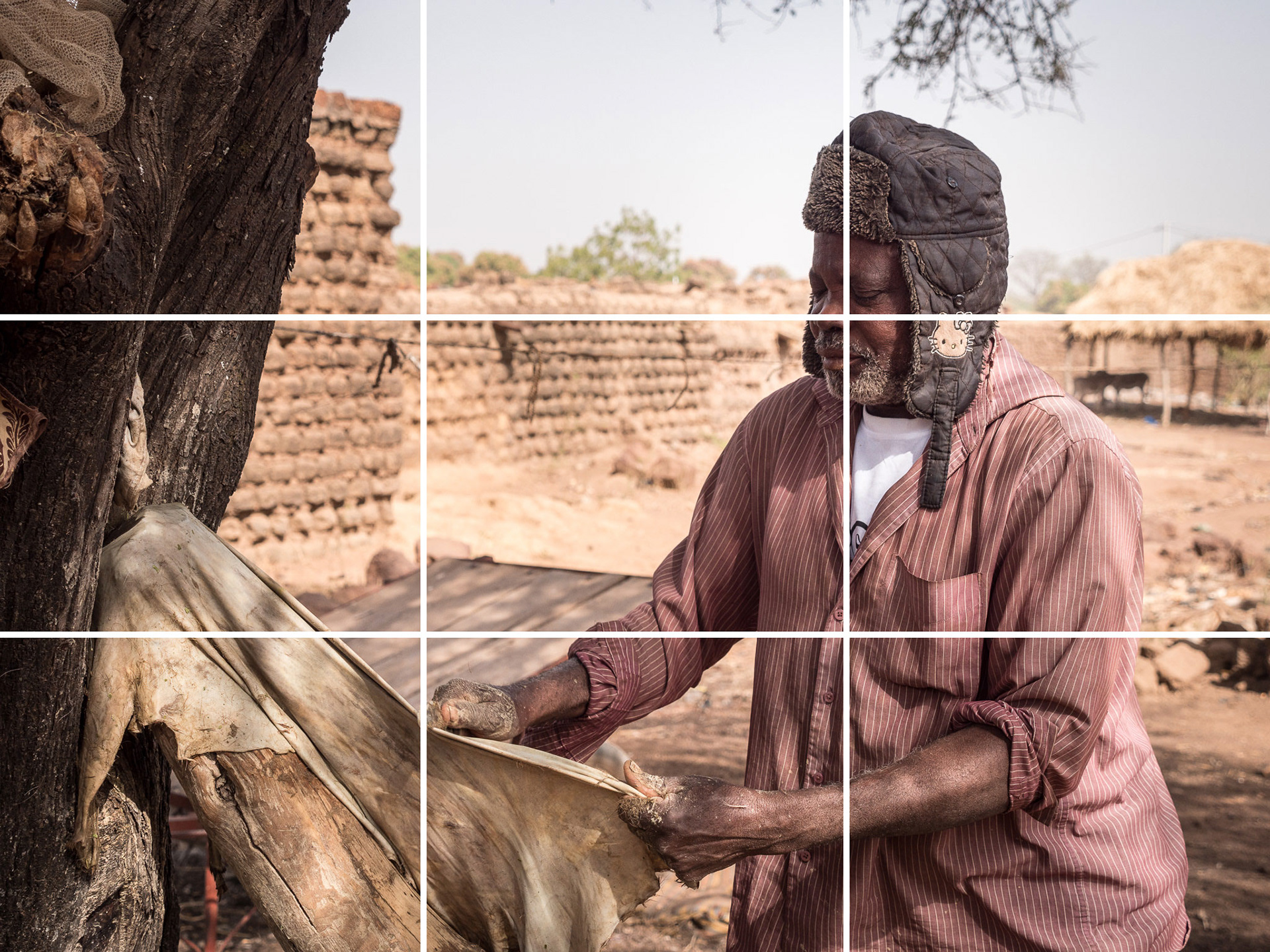
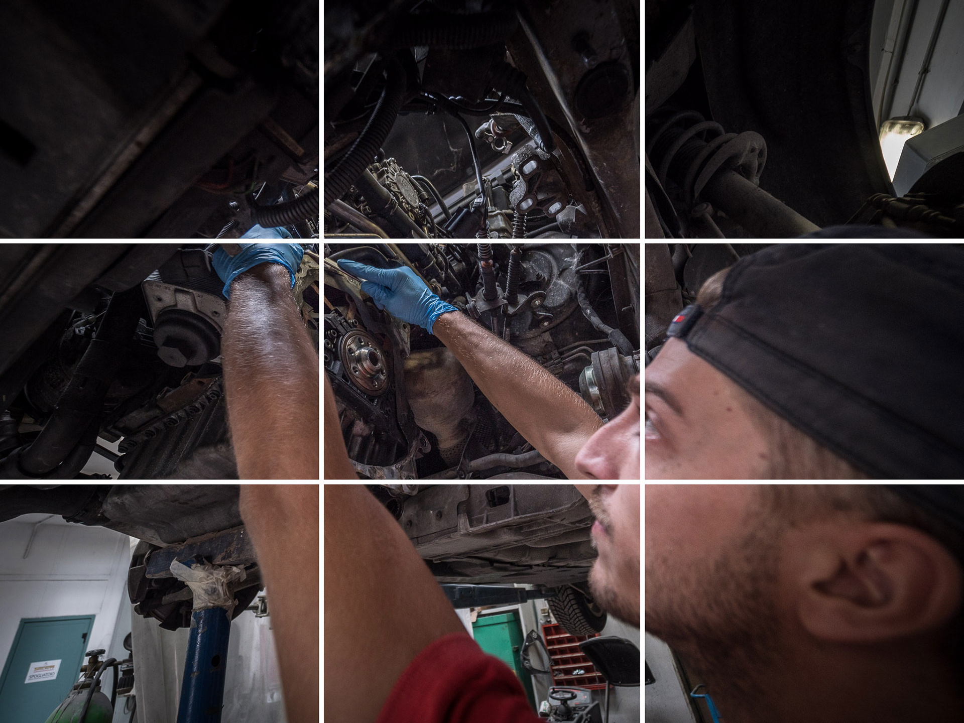
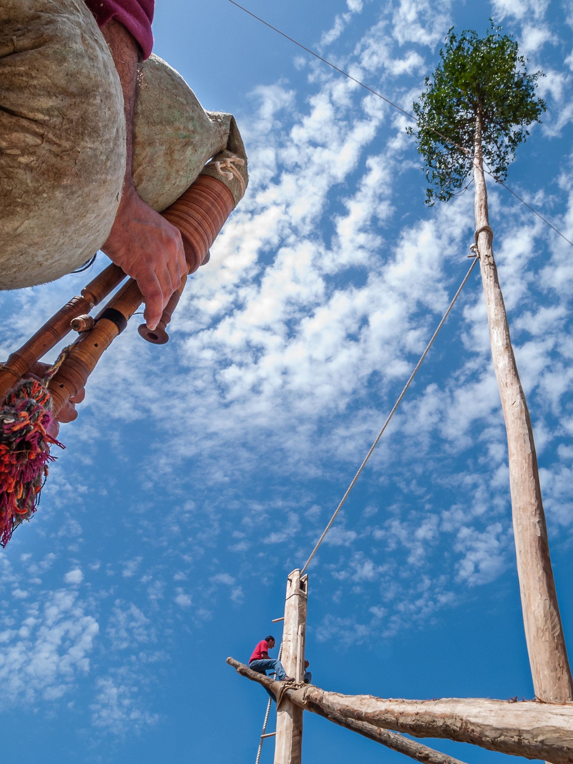
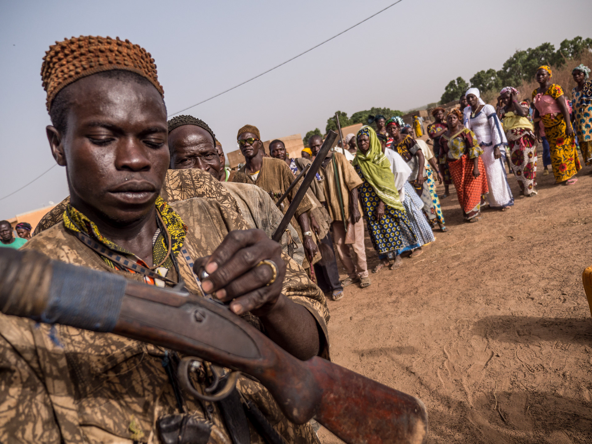
Depth through foreground
I use this one a lot, and you can see it as a merging of the principles of asymmetry and the use of leading lines. This technique consists of placing a foreground element near the edge of the frame and using it to lead the eye of the viewer into the depth of the image. It works particularly well with wide-angle lenses, as you have on most phones.
This is the more conventional framing
This is less conventional but might be more appropriate to the meaning of the scene
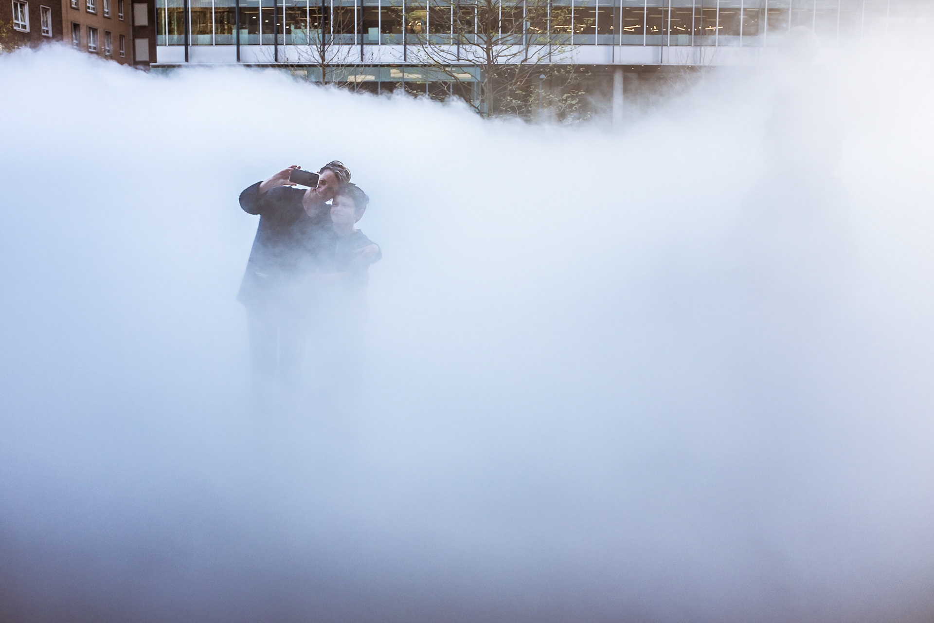
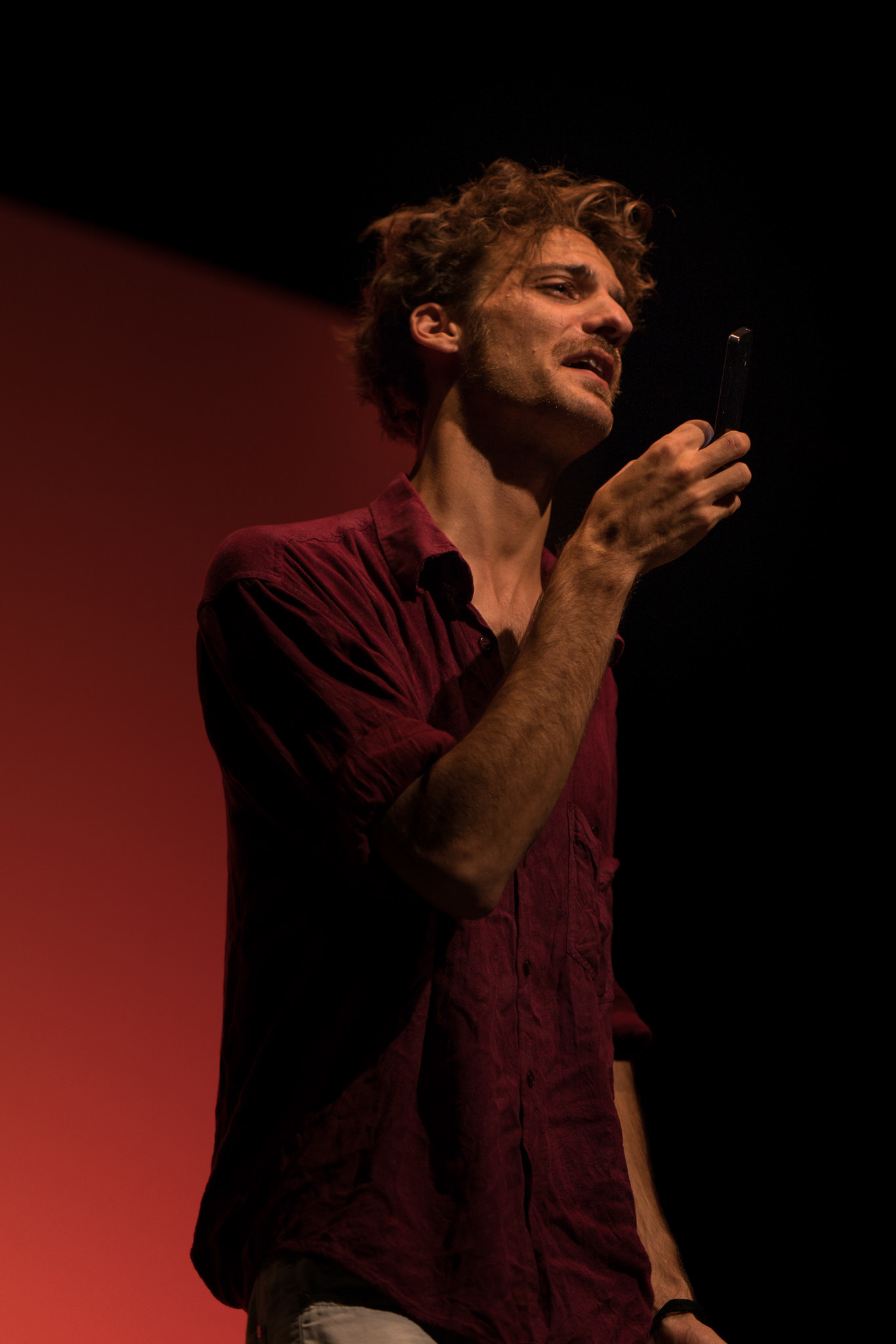
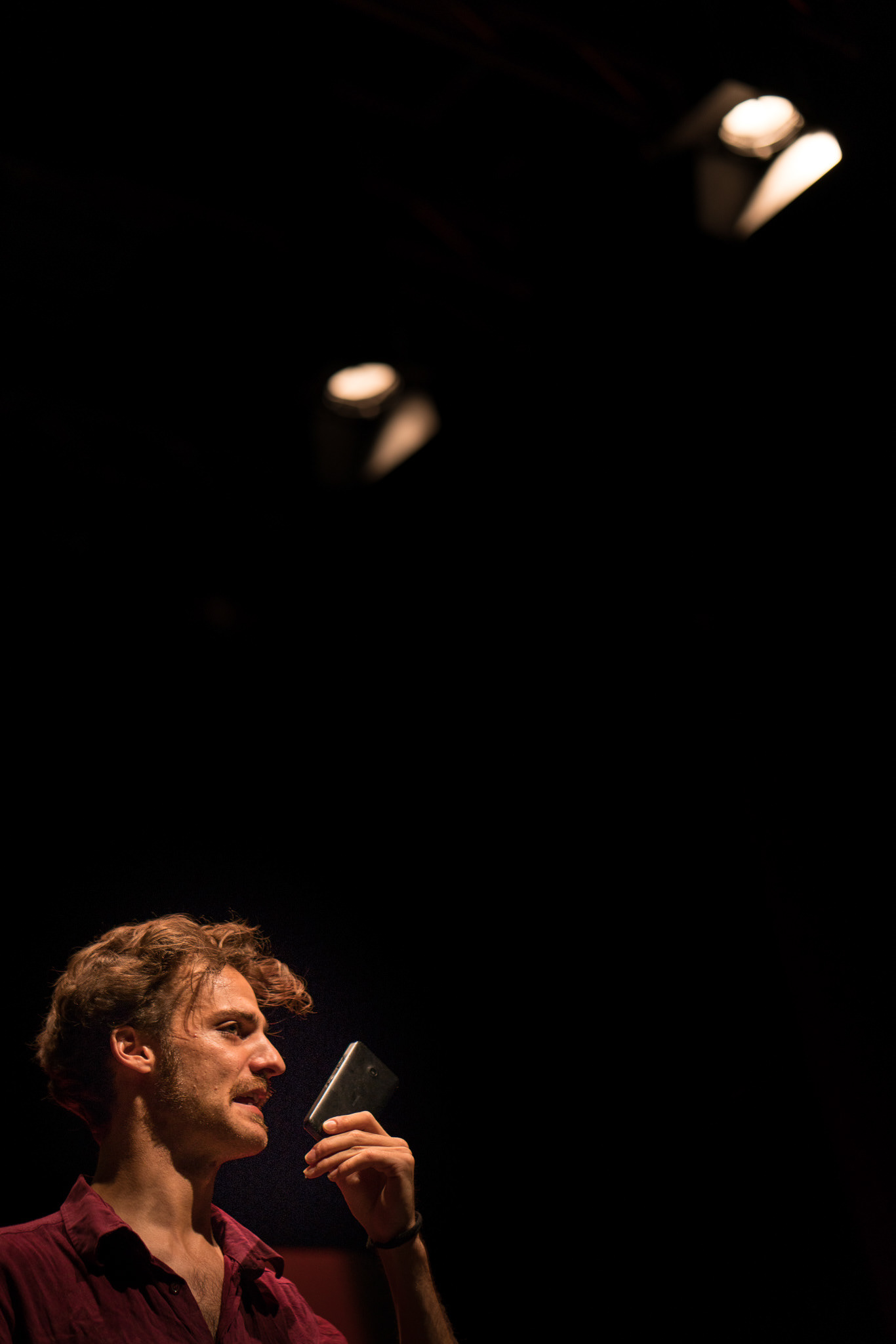
Negative space
Sometimes it can be tempting and it can make sense to fill up the frame with elements. At times, however, creating negative space in an image can be a very powerful way of drawing attention on certain elements, thanks to the emptiness that surrounds them. The resulting composition is minimalist, unlike most things we usually see, almost zen. There's a big difference between seeking this effect on purpose and having "unused" parts in an image, it has to look intentional.
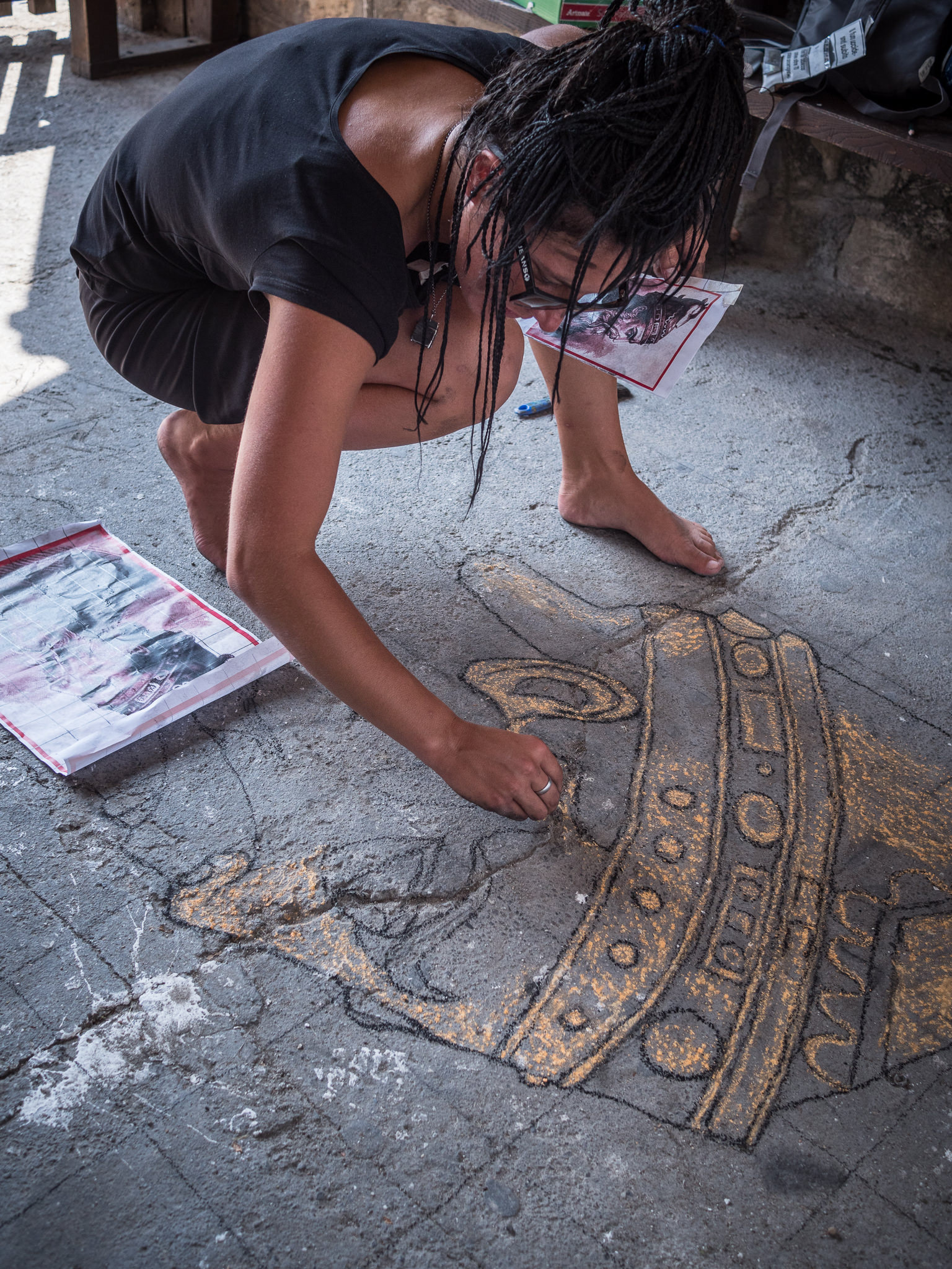
Here we can see what she's doing but we can't really relate to her
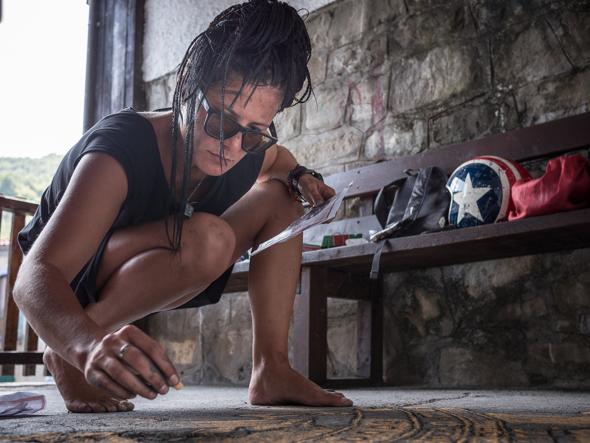
Here we can see her much better, have a sense of her concentration, but the work isn't as clear. It's always a compromise, what do you privilege?
In conclusion...
The best advice I can give you is not to be lazy, and to move a lot. Only by shifting your point of view you can see how many different configurations are possible. Sometimes you have to lie down, other times climb on a chair, and it makes a big difference. Moving your body in space can literally rearrange the elements of your photograph. Give it a try and keep looking at other photographers' work to learn in a visual way.
Exercise for next tutorial:
Self-portrait: This time, you are the subject. Plan 3 posed, self-timer shots (not selfies!) that describe you through the action you are performing in the shot or your positioning within your home environment.
Create a simple Web Page in Adobe Creative Cloud Express and upload the images there with a brief text. Submit the link on Blackboard 24 hours before next week's tutorial.